CUEAFS Reviews

Starry Starry Night

This is a Taiwanese film based on a graphic novel, which you can kind of see in the film in the way it is told.

The main character of the film is a young school girl named Mei. We immediately find out she is very close to her grandad who she used to live with, but moved in with her parents. At school, a new boy starts named Jay, and this fascinates Mei. Jay is an outcast, he carries a sketchbook around everywhere which he draws in frequently. Mei follows Jay around, watching him shoplifting from an art shop and copying him.

When Jay gets physically bullied Mei steps in and stops them and they become friends. Jay’s mother comes and picks him up from school and we begin to realise why he is an outcast. Him and his mother having been running away from his violent father so he doesn’t get chance to settle down. From this point on we also saw Mei’s parent’s marriage dissolve. They are arguing a lot and it is effecting Mei’s moods and attitude, but she gets by with her new found best friend.

They visit a jigsaw shop, where Mei tells Jay how much she loves them. Every year her and her parents complete a different jigsaw, but this year they’ve stopped helping. Their current project is Starry Starry Night by Van Gogh, and she’s missing one piece, the centre of the bright star.

The film then takes a negative spin and her parents divorce and grandad dies. Mei and Jay run away together, into the woods she lived in with her grandparents. They live in the shack where she finds numerous small carvings her grandfather had made for her and she treasures them. Unfortunately Mei then falls ill, and Jay makes the decision to take her to hospital and return home.

To add to all of this Jay’s father then returns to the scene and Jay and his mother have to move away. To the viewers knowledge Jay and Mei never see each other again and you feel quite heartbroken!

We then flash forward to Mei as an adult. Her mother is remarried, living in paris with a child on the way and they are on the phone. Mei is with her step sister and they look around an art gallery. They notice all paintings look asif they are missing on jigsaw piece and you immediately presume it is the work of Jay but we never find out.

I found this film quite difficult to follow with the subtitles but I can imagine if it was in English I would have quite enjoyed it. The story line was strong and the imagery emphasises the mood throughout. It was quite an upsetting story towards the end, and it leaves you feeling hopeful that the work was Jay’s and they get back in touch.

You Are The Apple of my Eye

This is a Taiwanese teen comedy film, based on the idea of growing up, love and school. We follow the main character Ko Teng through school and later life, and he narrates us periodically throughout.

In the beginning we are shown a scene of him getting ready to attend a wedding, it isn’t clear if it is his own or someone elses, but from the dialogue you get the impression it is his own. When it came to the ending this was upsetting because you expected this to be the outcome and it ended up being quite a twist!

Ko Teng in the trouble maker at school, he gets bad grades and sent out of classes on a regular basis because he just doesn’t bother working. When he is caught by the headmaster, he is ordered to sit in front of the honour student who every boy fancies. He appears to  not be interested and quite irritated by her, but she persists in trying to make him a better student.

Shen Chai-Yi (the honour student) sets him homework and quizzes to get him back on track, and through this Ko Teng starts to realise why all of his friends fancy her. They soon become very good friends, when Shen leaves her book at home and Ko Teng lends her his and he takes the punishment. Shen stands up for herself at this point and it is a pivotal point in the film.

Shen and her friend and Ko Teng and his then become a strong group of friends, and spend a lot of their time together. Ko Teng’s grades vastly improve and he starts to chase Shen. She is fully aware he likes her, but he refuses to let her say if she likes him or not because he doesn’t want to hear the wrong answer.

When they both move to different schools after graduation things get tough. They speak every day for a while, but after a big argument over Ko Teng’s fighting, they don’t speak, and Shen moves on to date other people. They discuss why things never progressed and Shen confesses that she enjoyed the chase too much, but did like him. She gets engaged to someone else, and we see a flash back of all the times Shen wanted to say she liked him. They set off a chinese lantern where you write your wishes on either side, and she had written on hers that she wanted to be with him. She had asked him if he wanted to know what she wrote and he said no and the viewer feels really gutted about that!

In the ending, Ko Teng humorously and passionately kisses Shen’s new husband after he said “you can kiss my wife, if you kiss me first how you wish to kiss her”. I left feeling half pleased, and half cheated. You are shown the clip again of them attending the wedding from the beginning and it’s made clear it was not his wedding, and I was really hopeful the entire way through that they would end up together.

I actually really enjoyed watching this film. It was funny, entertaining and had a good story line. I’m a sucker for a happy ending so I wasn’t impressed they didn’t end up together, but as a whole I didn’t regret watching it, and that shocked me as I’m not usually a fan of foreign films.

The Woodsman and the Rain

This film was based on a woodsman who helps out a young director. When he is asked to stop cutting trees during the shoot he begins to help out on set. They drive around looking for a location, which is tricky because the producer wants a location that is practical where the woodsman was looking for beautiful areas as this would obviously look better in the film.

The young director and one of the other helpers tries to run away. He leaves the script with the woodsman, but the producer catches him and doesn’t let him get on the train, he also tries to stop the other crew member but only succeeds in stealing his hat. The director then returns to the woodsman and asks for the script back, and he tells him how much he loves it and this gives him a little confidence and they start to work in partnership on making the film. We see the director has no confidence whatsoever and turns to the woodsman much too often for advice.

The woodsman co-directs the film from this point and helps gather crowds and shouts at them what to do. It is slightly comical at this point because the locals are all dressed up like zombies as extras. His family then come to visit and he has forgotten that he is supposed to be attending a family meeting for the anniversary of a family members death. We also find out around here that the young director has a bad relationship with his father, and throughout the film we have seen but not taken notice that the woodsman has a bad relationship with his son, and we realise why we were shown this and see how the woodsman can symphathise.

The director really struggles while the woodsman is away at the anniversary, but begins to hear the woodsmans voice in his head, pointing him in the right direction and giving him confidence. The film ends by flashing forward to seeing the director finally having confidence and running the show. His voice is loud and clear and he knows what he is doing, without relying on the woodsman, who has returned to his tree cutting job.

This film bored me to tears. It was extremely slow, uncreative and the dialogue was just terrible. The story line, on writing this review, now seems quite strong but it was realised in such a boring way it really ruins the film.

An artefact that explores under represented groups within the media

Brainstorm on what under represented groups there currently are

  • Women
  • Students
  • Ethnic and cultural minorities
  • Teenagers
  • People on benefits
  • Unemployed people
  • People without further education
  • Gay people
  • Disabled people
  • Young mums
  • Skaters

Initial Idea

My initial idea is with the group people without further education. I have two friends in average, unskilled jobs who have an amazing talent for singing. Neither have further education and the media severely under represent them because they don’t have a degree.. this puts them at a great disadvantage. I would like to make a video and perhaps a collection of stills showcasing their effort and talents, that often go unnoticed.

New Initial Idea

Unfortunately, although both of my friends agreed to this and would have loved to have take part, circumstances have caused one to not have enough time to create this artifact to the high standard I’d like, so I have decided to save this idea for a time it can be created to its full potential and move on to a new idea.

I’m going to go with a much more personal idea of representing people on benefits. I live in a council building, and have done for around a year now. This was due to unforeseen circumstances causing my dad to no longer be able to work. When we think of people living off the council benefits, we automatically think of young mums, chavs and families with 10 children. This is not the case in such a large portion of the people and its due to what the media feed us we think like that. I have lived in two blocks of flats and not come across any one particularly unpleasant, and most are there because of genuine reasons preventing them from providing enough to live off. I think with better representation there wouldn’t be such a stigma attached to living off benefits, because there wouldn’t be that automatic assumption that it’s by choice and down to laziness.

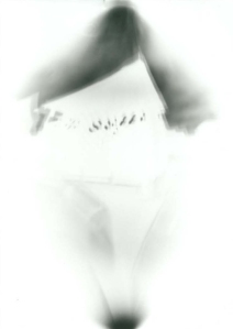
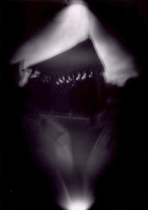
I have gained a real passion for pinhole photography and have been using cameras made from beer cans. It skews the image slightly and puts an odd twist on structures in particular. I think this could be perfect for this theme.. My idea is to take pictures with this technique in the building I live. Visitors describe it as hotel-like, the area is beautiful and the building kept clean and tidy. We take pride in where we live, there are 12 flats in the block and we all get on and look out for each other. The images will show the building for how it is, but the skew will represent how the media don’t represent it fully. You never see the true picture.

Research

I have tried using the internet to look for how the media portray people on benefits and didn’t really get any results.

Screen Shot 2013-05-28 at 09.46.41

As you can see the only thing commented on is disabled people or people in complete poverty. While this is very frustrating, atleast I know I’ve picked a topic that really is under represented!!

I played around with what I searched and came across this website: http://www.guardian.co.uk/politics/2013/apr/06/welfare-britain-facts-myths which discussed the misrepresentation and put the facts on the table. It stated that the myth of multiple generations never working is completely untrue and even if this does occur it is a very very tiny percentage. It proves that the media make it seem much worse than it is, and just doesn’t show the good people who are on benefits due to illness and redundancy. The only time we hear about it is when it is a nationwide problem, for example during the recession and the closing of lots of British car manufacturers there was a lot of coverage then.

Further research added 22.05.13

I decided to write up what I discovered watching the Channel 4 program “Skint”. I also found this reflection on it by Felicity Ransom: http://www.cleardebt.co.uk/blog/skint-observational-documentary-or-media-manipulation_79562

Skint is a tongue in cheek documentary about a group of people living off benefits. It has been criticised for being another reality TV show but Channel 4 have made a statement saying it is supposed to be telling the story of their real every day lives.

Told with energy, humour and boldness, this series offers an insight into their lives: highlighting social issues such as youth unemployment, crime, welfare dependency, truancy and addiction; but with the characters also revealing their ingenuity, resilience, community support and love and pride of family. Skint gets behind the headlines as people, often maligned for their lifestyle, offer their own story and show the real impact of worklessness – both today and over generations.

They have also been criticised for representing people on benefits in a wrong and negative way, making them out to be much worse than they actually are. We can all agree that some neighborhoods have rough areas where there are people on low incomes that disrupt the area, but this is a minority and critics are saying Channel 4 have only represented that part. While I agree with this, who would watch a TV program on me and my dad doing the weekly shop and getting on with our average lives? No one. The program has been created to show you what that group of people like, and at no point has it said ‘this is what every person on benefits is like’. To me, they have created a hard-hitting and interesting program showing how some people live. Yes it does encourage the misrepresentation of people on benefits, but due to the under representation already created by the media, this is what we expect and as a viewer want to see.

After watching more of the series I noticed how the narrator actually justifies the whole program. He talks about how it is just a select few that live this way, in a casual and clever way that doesn’t victimise them. I think this is a really good and insightful program for entertainment purposes and to see how some people do live, but it shouldn’t be taken as a true representation for the whole.

Skint, on Channel 4: http://www.channel4.com/programmes/skint/4od#3525391

Preparing for shooting

I have used the beer cans as pinhole cameras before and it took around 5 seconds to expose on a bright but overcast day. Indoors I realised it was going to take a lot more time than it was possible for me to use. In my building the residents are very clean and tidy, and did not approve of me taping old beer cans to the walls as this is the only way I could keep it still for long enough. Because of this I slightly changed my idea to documenting the area as a whole rather than just my building. It is a very built up area, with some greenery in the centre, so I am going to take pictures around my building from all different angles to show all aspects of the estate.

I will be shooting on what is predicted to be a very gloomy day, so I am going to expose my images for much longer. I have 7 cameras so to ensure I get some images I am going to expose two at 8 seconds, three at 10 and two at 12. I anticipate to have somewhat blurred images due to the length of the exposure time but this doesn’t worry me too much as I like that effect and it will further emphasise the message of misrepresentation.

Shooting

1 3 4 5 6

These are the negatives I got, and I am fairly happy with them. I can already see they are quite blurred and will produce fairly dark images but overall I think it’s been quite a successful shoot. The blurriness will help with the misrepresentation and the darker tones will emphasise the negative attitude. I am going to invert my images and edit them so the tones are all equal and giving across the atmosphere I am aiming for.

1edited 3edited 4edited 5edited 6edited

These are my inverted and edited images and I’m really happy with them. In particular the first one because I was much closer up. You can see the area, buildings and trees, but not clearly and they appear really dull. This is exactly what I wanted because the area is absolutely beautiful, and while you can see it, you don’t get that sense of home and pride that is present. In the images you just see an average area, that’s messy and skewed, exactly how the media portray it, when they even do. If I was to redo this task I would have spent much more time researching into different ways in which the media portray people on benefits so I could have maybe shot multiple times at different areas to show a wider scale. I also would have got much closer up, and reshot these images for a slightly longer time to get more detail in the images.

Critical Reflections

Reflection One – How my understanding of light has changed

When I first started this module I searched for 10 interesting uses of light, most of them were people I’d heard of and wanted to look further into or people I found through association and this was a really good start for me. It made me begin with an open mind as I saw all the possibilities achievable when you know how to control light. Since completing the module I feel I can control it much better. If I imagine an image in my head I know what lighting would be needed, can I use ambient lighting or do I need artificial light from flashes? I also have learned that it’s much more flexible than you’d imagine. For example using reflectors and gels can create really interesting results I never would have thought achievable so simply. It is no longer something I have to consider when shooting my images, it is everything I need to consider. The lighting set up can make or break an image at it’s core, and then you can also use it creatively to be the subject itself. I don’t feel I have used my knowledge as much as I should have in the tasks, because I felt very time pressured. Especially on Task 3 where I only had the one opportunity to shoot. I feel if I were to redo the easter task I wouldn’t change anything, but I definitely wish I’d used this information throughout my work as it could have really improved my work.

Reflection Two – How my practice has developed

My practice has developed immensely over this module. Especially in the pinhole task. I’ve really enjoyed going back to basics and going for the traditional look, as this is what I’m personally interested in. I completely fell in love with my images from that task as soon as I’d created them and it’s definitely something I’m going to pursue further. Task 1, creating the manual, has also been a great help to me because I’ve actually seen everything I’ve learned which I may have not taken in otherwise. While it was difficult to create so I went back to using a simpler format (Powerpoint), it was worth the time and will be kept for future records not just as a task. Task 3 was the describing a personality task and I struggled with this one the most. I wanted to convey a natural look so used mostly ambient light, with only a small household lamp in the image shots. Due to the location of my subject (we live in separate towns, no where near Coventry) I couldn’t take out any bulky flashes and I only had the one chance to shoot. I feel like my images were successful but if I were to redo I’d use a closer by model and experiment more with the lighting, because while I am confident I could achieve whatever I imagine it would have been beneficial to try it for real not just practicing.

Task Four

This task was to take some images at Draycote Water to enter their photography competition. It’s quite an open brief, and we are required to submit between 2 -5 photographs. The main idea is to take a stunning photograph of one of their reservoirs to be featured in the calendar.

http://www.stwater.co.uk/content/ConMediaFile/3373 – Terms and Conditions

These are the successful images I took:

1 2 3 4 5

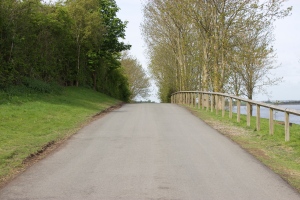
My favourites are the second and last one, because they look quite pretty and I think that’s the idea they’re trying to put across, that the landscapes and area is quite picturesque. I didn’t get many good larger scale shots as it was quite a miserable day and I struggled to get any real atmosphere in them.

Eg:

IMG_9910

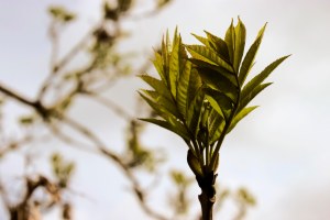
I think the two I am going to submit will be the following too as I really like the natural and pretty air about them. The colours are vibrant and give off a positive atmosphere.

5 2

Task Three

Task three is to create a series of 5 images, showing some ones personality. It needs to consist of 2 portraits and 3 objects, and we must use the knowledge we’ve gained on how lighting effects an image.

My subject is going to be my best friend Sam Richardson. I’ve known her for over 11 years and has one of the most beautiful and exciting personalities I’ve ever come across.

Screen Shot 2013-05-02 at 22.49.13

We sat and talked for a while about what aspect of her personality I’d like to get across and it was just impossible. She’s bubbly and social, an animal lover and vegetarian, works as hard as she can and parties even harder. She ice skates and dances, sings and performs, and my two favourite points: she’s stunning and the most loyal friend you’ll find. HOW DO I CONVEY THAT IN FIVE IMAGES?

Ideas for the portraits:

I’m thinking, lets mix things up a little.. have her all dolled up, but maybe somewhere natural with ambient lighting. She definitely needs to be happy and smiling rather than posed. Also, a key point to me is how teeny weeny she is, so maybe have something like a huge tree in the image to emphasise that? She’s also a very strong minded character, so she needs to look in control.

Ideas for the objects:

One object will definitely be something to do with ice skating as that’s what she’s really focusing on at the minute. I’ll try and communicate how passionate and dedicated she is by creating a soft but striking image, making the object look important and treasured.

Rebecca Parker

I am looking into Rebecca Parker’s work because I remember her doing a lot of natural portrait shoots. I thought it would be a good idea too familiarise myself with the possibilities and understand more how light can be used in a natural setting.

Screen Shot 2013-05-17 at 10.35.00 Screen Shot 2013-05-17 at 10.35.26 Screen Shot 2013-05-17 at 10.37.13

I want my images to be less fashion styled than these, but it you can see that the lighting is balanced and appears natural. There are no harsh shadows and they don’t have that studio lit air about them. The models don’t look forced which further helps the natural feel, and even though they are posed you almost believe you’ve caught them unaware.

Final idea and what I want to achieve

From looking into Rebecca Parker’s work I can see I’m going to need fairly natural light to get the tones I want. Because of this, rather than trying to recreate a natural look, I am going to shoot without lights at around 2pm. This is so it is still very bright, but not as strong as middle of the day. I’m hoping for an overcast day so the shadows aren’t unattractive but due to two very busy schedules it is something I’ll have to hope for the best for as I can’t work around weather forecasts. I am going to try and get at least one really natural happy image, I am going to achieve this by capturing Sam unawares when she is laughing. The shoot itself is going to be as casual as possible to ensure Sam is comfortable in front of the camera as she hasn’t been a model before. I am going to try some posed shots as I can see from Parker’s work it does still look effective and doesn’t void the natural theme as I’d expected. As for the still life images, I am definitely going to shoot her ice skates, and as we will be shooting near the snowdome, if I can get permission I will take the images in there. Another thing I know Sam for, is her Thomas Sabo bracelet that she treasures like a child, so I will try and capture the precious feelings. For the last item I am going to ask her to bring one of her favourite possessions. This is to add a little spontaneity, and ensure it fully represents her, not just what I think of her.

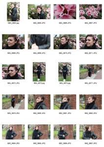
All images from shoot:

all objects all portraits_Page_1 all portraits_Page_2 all portraits_Page_3

I’m relatively happy with how the shoot went. I used a small lamp to illuminate the objects, and natural lighting for the ice skates and portraits. I think I’ve really captured her personality, showing the variety of sides and interests she has. I look at the images of the bracelet and can tell how much it means, and I think this is by the shallow depth of field creating a soft image, the warm tone and the fact it is so up close and personal. We had a really fun time on the shoot and this was key to ensure the natural, happy portraits were real and didn’t look posed. For the favourite object, Sam brought her favourite pair of heels. I should have guessed this, as she is a typical girl in the sense she can’t buy enough shoes! I decided to put them in a natural setting on a shelf to go with the natural theme and ensure it blended with the rest of the images.

Edited favourite images:

final 10

These are my favourite images from the shoot. I have edited them  so they are all of a similar tone and added a vignette to them all as to me, it felt like you were peeking in on the images. This is how I felt about these images, that I was capturing snippets of her personality for people to peek at, because it’s not often you see someone described like that.


Final images:

4 8 9 10 1

I chose these images for their overall strength. Together I feel they describe Sam exactly how she is. She is bubbly, passionate, beautiful and considerate. You don’t feel like she is pretending to be something she’s not for the images, because she isn’t. Even the posed image just looks like she’s in control. I think I’ve learned a lot from my research and it’s really helped progress my skills.

Photobook club session

When researching..

Include links to other things (your work, others work)

Link to people that work in a similar way, inspirations, understand the category, previous work, work from the same time by others

Task 1 – pick a book and present on the aesthetic use of light, conceptual use of light, image demonstration

Task 2 – write 500 words illustrating a 4 degree connection to a body of work that interests you in its use of light. It should begin with one of the books from this session. Connections do not have to be based on light.

Notes for presentation

Gregory Crewdson –

Aesthetic  – strong, well lit, perfect and considered, different layers illuminated differently

Conceptual – film still, atmospheric, flat and perfect, made to look natural but enhanced, feels animated and painted

An image – show one from each, compare the difference between natural and delicate light which makes us feel almost nostalgic in sanctuary, to the staged lighting in beneath the roses

Task Two

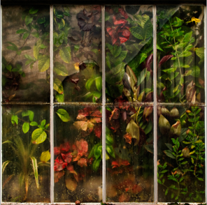
The first set of work I’m going to look at is Gregory Crewdson’s images of abandoned film sets. He has used natural, soft light to make you feel nostalgic when you look at them.

95bb44c005090ac136b0c75ced02a3e3_0

They are large in scale with a wide depth of field, depicting the whole area. They aren’t staged like a lot of his other works, which made them stand out to me. The aspect that hooked me is the natural feel to it, it still looks like a film set but it makes you feel differently to how they normally would.

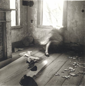
This made me think about Francesca Woodman’s use of natural light and how she uses it to change the atmosphere. A lot of her work is in abandoned and derelict spaces where she becomes a part of the scene. She uses long shutter speeds to capture her movement and blend in with the surroundings.

Screen Shot 2013-05-17 at 11.28.59

The natural aspect is emphasised by the strong light coming from the window and the movement captured. It makes you believe the scenario is actually happening and you’ve walked in on it. The tones are very grey and while there are some extreme blacks and whites it is predominantly mid-tonal. It all contributes to an old and troubled atmosphere. The key feature in these to me is the capture of movement, it shows Woodman becoming a part of the building, at one with her surroundings.

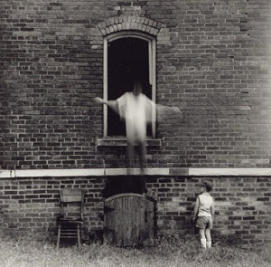
This then led me onto Ralph Eugene Meatyard’s images of the young boy where his motions are also captured.

Screen Shot 2013-05-17 at 11.35.46 Screen Shot 2013-05-17 at 11.36.28

Again there is an old and natural atmosphere which is enhanced by the movement. And to me, I feel both have quite an eery other worldly sense to them. Both figures look angel like, and the movement has been captured quite serenely. We know that those actions would have been fast and quite the opposite of serene but he has captured the perfect moment for the perfect amount of time to show his true meaning.

Looking through some more of his work I discovered a wide range of images where his subjects were wearing masks.

Screen Shot 2013-05-17 at 11.36.43

The images still had that old and natural theme but something strange had been added. You really questioned what was going on and it actually emphasised all the other natural objects. Another artist who did this was Cindy Sherman.

Screen Shot 2013-05-18 at 16.26.58 Screen Shot 2013-05-18 at 16.27.21

These images appear natural at a quick glance, but then you notice something really strange about them. The faces seem fake and you wonder what has happened to them. Do they think this is a good look? It’s only after further research you realise they are all self portraits by Sherman wearing masks. She is dressing up as other people and over emphasising some of their key features, to create an almost scary collection of images.

Second location and studio workshops

Location

2 flashes

This image was took using a handheld flash light. We took out two but unfortunately one ran out of batteries and with only half an hour to shoot we decided to use our time wisely and experiment with the one. We chose this location to show we could balance the whole scene by not using the flash too strongly. Everything is exposed well, with only a slight harsh highlight on the one side which with more time could have been fixed by using the other light on the other side to even it out therefore reduce exposure time and removing the harsh light.

1 flash 2 better

This was shot with one studio light, slightly to the side of the camera but mostly to the front. Again we wanted to capture the colours and surroundings so kept it quite natural looking. We used the flash to fill in, rather than change, and this is shown in how there are no harsh unwanted shadows.

1 flash

This is another with the one studio light, and you can see more clearly how it has filled in the subject. There is no unflattering shadow under the chin that mid day sunlight normally causes.

1 flash and reflector

This image was shot with a studio light and a large white reflector. We set the light up at an angle to the subject so we could see the effects of the reflector which we held in an opposite position, bouncing the light back to the other side of the subject. This is the best image we came out with, showing the balanced light. The other problem we encountered on this shoot was getting the background (through the window) well exposed. To do this, we moved the lights further away, allowing the shutter to be open for a greater time and letting the background expose more.

making the background darker

This was one of the more experimental images. We were trying to have a darker background. So we moved the model and lights much further away from the tree so the flash would not illuminate it as much. We then set the camera to correctly expose the model, leaving the tree/background underexposed, looking darker and seperated.

Studio

dark backdrop

light backdrop

These two images were about how to use the lights to create different backgrounds. By moving further away from the back drop, and aiming the lights towards the model, it created an underexposed and therefore grey background. To create a white background we faced lights towards the back drop to keep it well illuminated. To get correct exposures on both areas we used a light meter to adjust the lights until they both read the same settings.

clear

We then moved on to still life photography. And decided to use this glass candle holder as it provided really interested light reflections and we’d be able to see the highlights and shadows clearly. We used the infinity curve so we could also light it from behind and give it the advertising look. This is the perfectly exposed shot, simple and effective.

little pink

This was starting to experiment with different lighting set ups and using gels. We had two lights placed at either side of the object, and covered on with a pink gel. This made the one side much brighter, creating the slightly washed out look, which also cancelled out a lot of the pink colouring.

Pink

This image was shot with just the one light on with the gel over the top. You can see the shadows that we removed in all the other shots and it’s added a nice quality to the image because it is going for a more experimental look rather than perfect. It is interesting to look at, in oppose to the others which were successful for descriptive purposes not overall look.

An Artefact informed by extra curricular activity

Brainstorm on what extra curricular activities I do:

  • Setting up an exhibition
  • Cooking
  • Driving
  • Drawing/art
  • Sketchbooking
  • Working on an allotment

Initial Idea

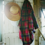
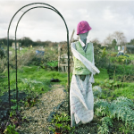
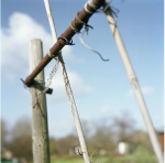
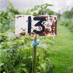
My initial idea for this task is to roll with the activity of working on an allotment. My dad has his own, and his dad is on the committee, so it has been a strong, dominant and educational part of my families life. I often visit and help out where I can, and have a keen interest in learning about how it all works. I intend on making a series of images based on this.

Research into ‘Garden Photography’

I thought it would be best to start off researching into contemporary photography within the gardening community. I came across the International Garden Photographer of the Year (http://www.igpoty.com/) and discovered a really wide range of nature photography. I am leaning more towards nature photography than portraits or anything else, as a key part of working on an allotment is that the things you grow are priority. If you’re tired but you got stuff to do, you carry on. If you’re late for a really important date but your protective cover isn’t quite finished, you carry on. I think it would do well to focus on the plants, for that reason.

Screen Shot 2013-04-19 at 21.15.40

The overall winner this year was a striking landscape shot, showing a small section of flowers. The lighting is interesting and beautiful, enhancing the natural beauty it envelopes. Everything about the composition is perfect, making you feel comfortable to view it. It projects a relaxing but strong atmosphere. Unfortunately the allotments are far from stunning at this time of year, especially after such a long, cold winter, so this will not be a route I will find easy to go down, as it isn’t an attractive enough landscape for that to be the key feature.

Screen Shot 2013-04-19 at 21.16.03

I found this image particularly interesting as it really gives a sense of growth and nature and providing for yourself. The atmosphere is everything I feel about the allotments and it has shown me I need to keep the colours varied but natural and strong. The lighting is just as important as that of a person to ensure maximum strength.

Screen Shot 2013-04-19 at 21.16.42

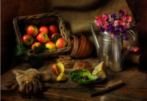
The same applies to this image. It is almost painterly in its lighting and softness, but it also appears natural due to the objects, surroundings and lack of unusual shadows. It is shot with natural light from a window, which goes to show you don’t need fancy set ups to make natural things look good, they look best how they are.

Screen Shot 2013-04-19 at 21.16.28

There was a section of the competition entitled ‘Bountiful Earth’ for images showing gardening to grow food, and again this images were detailed, soft and striking. There was no unusual or harsh lights distracting from the natural beauty, and this is something I’m really going to take with me onto my shoots. It doesn’t need fancy angles or crazy colours, the beauty is in the simplicity.

The section that really caught my eye, was the ‘Macro Art’ project. Here is a selection of images I thought were really beautiful and showed the natural beauty perfectly:

They all are clearly of natural objects but you can’t quite tell what. They are attractive and the colours are beautiful, and this added to the detail and depth of field creates a selection of images that really sum up how people feel about nature. I think this could work brilliantly for my task, because it would show the dedication and passion we all feel for the plants. It’s not about growing enough potatoes to see us through the winter. It’s about family, tradition and growth in more than one way.

Research into ‘Allotment Photography’

My next move is to research other peoples projects photographing allotments to see their approaches. It might be that I incorporate a variety of styles to depict the variety of work undertaken, or the range of approaches different gardeners take to achieve their own unique results.

The first person I came across was Paul Tucker and his series of images called ‘Allotments’. (info and images from http://www.paultucker.co.uk/allotments.htm) Tucker is a London-based commercial photographer who also pursues a number of personal projects along side his paid work.

His images effectively show all aspects of an allotment. The way people personalise things, the tatty make-do fixings, the fruits coming out. I have seen how by emphasising that personal aspect, it doesn’t matter the ground is brown and the skies grey, its the small things that shine through and make the image a success.

The plotholders cultivate and recycle in many different ways creating a unique environment that is somewhere between domesticity and wilderness – Paul Tucker

The next person I found was Mark Bolton. He covers a wide range of photography, available for commission and also producing a lot of his own work. He won an award in the International Garden Photographer of the Year ‘Edible’ section, and works on his own allotment in Bristol. He has created a large collection of images from his allotment and the first thing I noticed was his amazing use of colour and light. They are strong and bright, with some being taken at twilight with a beautiful moody light drifting over the allotments.

Screen Shot 2013-04-23 at 18.24.34 Screen Shot 2013-04-23 at 18.24.47 Screen Shot 2013-04-23 at 18.25.20

I particularly chose these images because of the strength they hold individually. The second one has a really beautiful strong sun light, which I think really sums up the peaceful atmosphere that can be found on an allotment. A lot of people use it as an escape from the stress of modern life, and I feel like that doesn’t exist when I’m looking at that image. I looked specifically at the last one because this is the kind of area I am going to be working with. It is not far along enough in the year for there to be bright colours or big plants, it is going to look quite bland and dreary if I can get it exposed this well with such strong colours coming through.

Shooting

I’m going to look around first and just look at how the light effects different things, to see the kind of light I am working with. It is going to be afternoon time when I go so the sun isn’t at it’s peak but still quite bright. This will help me get the strong light I need without being too much and creating unsightly shadows. Ideally I would have a macro lens with me, but this will not be available on my shoot date so I am going to take a standard zoom lens and a telephoto lens (to get to hard to reach places, it isn’t going to be a good idea to stop over peoples plants to get the right photo). My aim is to capture the small details that go into the work, to show the things that are passed down through the generations. I am also going to take some wider shots just to show the area and set the scene within the collection of images. I think it is going to be important to have a variety of styles of shots, as long as they are all strong and sequence together well.

HOW IT WENT…

It went absolutely fantastic. It was a very bright day so the shadows were still quite strong, which meant I had to be careful where I positioned myself. Other than that, everything was peachy. I knew exactly what I wanted and how to achieve it, so it was actually a really enjoyable shoot producing my ideas. I got my nan to walk around with me, so anything I was uncertain of she explained to me, so it was even more of a learning experience.. which was brilliant seeing as part of what I was trying to capture was the banks of knowledge passed down through the generations!

Images

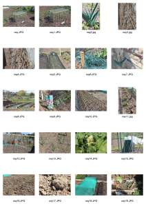
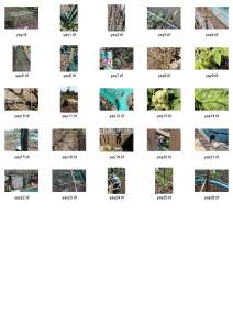
First I went through all my images and seperated out all the weak ones..

Screen Shot 2013-05-02 at 21.46.13

These are my not so successful images. Some are because I took multiple versions of the same one, some are just weak in comparison to the rest. This was the easiest of the editing down, I just removed all of the ones with no strength on their own.

nay image_Page_1 nay image_Page_2

I was left with these images below. They are strong as singles, but also show potential to work in the series I am aiming to produce. I edited all of these images so I can see their full potential before the next cutting down session.

allotment edits image

Screen Shot 2013-05-02 at 21.46.25

It was very difficult deciding which images would make the final cut. I didn’t have a set number in mind, I just wanted to make sure only the strongest, most coherent images made it in. I wanted the whole message of knowledge, tradition and pride to be shown in the strongest possible way. I got all of the images up in a JPEG from a Bridge contact sheet and loaded it into Photoshop..

Screen Shot 2013-05-02 at 19.12.01

It was much easier to decide when I could see them all together. I added a layer on and put purple splodges over the ones that stood out and depicted what I wanted the best. It was nice working without a set number in mind because it meant I could be as picky as I wanted, I didn’t have to put any in that would compromise the strength to make up numbers. Overall I’ve found this task really refreshing and exciting!

So these are my final images..

final images image

I am 100% happy with every one of them. They show the detail that goes into keeping the allotment running smoothly. They show the personalisation and pride that the people bring onto the land. And most importantly, it shows the beauty of what can be achieved when knowledge is passed through the generations. I think the colours sum up the atmosphere of warmth and nature you feel when you’re there, and I have purposely not included any people in the images because I wanted to show the good effect people can have, not them actually working.

Screen Shot 2013-05-02 at 21.47.10

I have saved my images like this, so I have a variety of versions of them for different purposes. The TIFFS include layers so they are editable, the JPEGS are around 10 MB in size and a good quality for showcasing or printing, and the small JPEGS are useful for quick and easy access where quality isn’t an issue.

Studio and Location workshops

In smaller groups we have completed practical workshops to further get to grips with the lighting equipment. We were set small tasks in each to ensure we knew how to achieve certain results.

Location

In this workshop, we went outside the back of the university to a location that gave us the option to use a combination of ambient light, mixed light or just flash light. First we were just told to think of our own ideas and get comfortable organising the team and lights to create what we imagine.

1 copy 2 copy

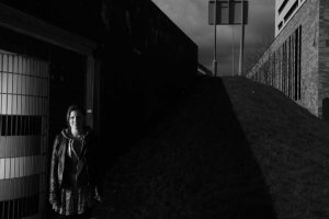
These were the first two images we took on location. The first one was using ambient (natural) light, and is exposed very well. We chose this location because the lines across the wall were appealing and it was on the edge of the underpass so Vikki was illuminated from the sunlight. We next tried a shoot in the same place but using lighting. We placed the light just to the right of the photographer facing away from the model with an umbrella bouncing the light back. We changed the in camera settings to b&w so we could see more clearly where the light was falling. I liked this image, but because we were exposing Vikki to ‘zone 5’ with a flash, it made the background underexposed, which in this image works well but it could cause complications in other shoots.

3 copy 4 copy

In this image we wanted to again use a mixture of ambient and artificial light. The first image shows us using the flash to illuminate Jenny, but the outside is extremely underexposed. We fixed this by turning the flash down, meaning it took more exposure to get the shot, allowing more of the outside to expose.

5 copy

It took a lot of shots to get this one perfect, and still we are left with sun spots on the top! As there was a lot of natural light around they were perfectly exposed without the need for artificial light. You can see the highlights from the sun in their hair, which I think illuminates them really well and separates them from the background.

6 copy7 copy 8 copy

These are the previous shots that didn’t work so well. And I will use these as guides in my manual as to how to problem solve these issues. In the first two images we tried to use flash, but it just wasn’t necessary and ended up with very bright images because we couldn’t lower the shutter speed any more due to syncing with the flash. The last image was when we slightly underexposed it without the flash, it left the image dark and flat and while it didn’t immediately look bad, when compared to a correct exposure it just doesn’t hold the strength.

9 copy

This was an idea of one of my classmates to create a silhouette figure. We didn’t have enough lighting equipment to do this in a normal position, so we had to stand Aaron right in front of the light and create it by flashing the light as high as possible and not setting the camera to make him at zone 5, we wanted everything to be vastly over or under exposed (light over, model under).

11 copy 12 copy

This was a task set by Melissa, to have one person stood in the light, and one much further back in the shade, and have them both correctly exposed. To do this we set the flash onto me (the back model) and worked out how bright it needed to be to match the light reading to correctly expose Jenny (front model). It took a few tests and a lot of light readings, but eventually we got a decent image (the latter one).

13 copy

This was the last image we took. The aim was to have Melissa partially visible but correctly exposed, while still having the sky correctly exposed too. We had the light on Melissa’s right hand side and set it to be bright enough to match the exposure of the sky. This made a lot of the rest of the image too dark but this helps the atmosphere in this image. To correct this if it wasn’t ideal, you would need more lights to illuminate the rest of the scene.

Studio

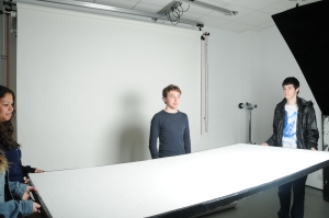
In this workshop we were given a few tasks to get us started, but mostly we just had to experiment and see what happens when we use different lighting techniques.

setupsoftbox1 softbox1

First we were to see what happened when we illuminated a person with a soft box directly next to them. As you can see it creates very harsh shadows down one side of the figure, and when we introduced a black board on the opposite side it absorbed the light and made it even darker on that side.

softboxinfront

This one was created with a light in front of the subject, just above the camera. It evens out the light well, leaving no unsightly shadows, but leaving some natural ones for example under the chin.

softboxreflector

setupsoftboxreflector

This last one was created as you can see in the second image, with the same set up but with a reflector under the subjects face. This got rid of the natural shadows left on the first image. It created quite a washed out look, but it is also slightly over exposed which hasn’t helped on this particular image.

lookingatskintones

We then had a look at skin town in images, and Caroline spoke to us about how in fashion you will often find the lighting is arranged to make skin look fairer because this is more flattering. We stood the palest and darkest skinned people from our group to see how the same lighting effected different skins.

honeycomb

This is probably the most successful image we took, as it looks really atmospheric and we created the desired effect really well. We used the lighting to create a mood, and this was the main outcome of the workshop. To create it, we used a honeycomb attachment and directed it towards the model, it only illuminated her like a spot light would, and left a lovely effect on the back drop too because it wasn’t a harsh circle.

Jonathan Shaw – Light & Time

What is light?

“Visible Light” refers to the small fraction of light that is visible to the human eye. We can use different lights creatively to get different effects that confuse and intrigue us, such as infrared film. (see for example Richard Mosse’s work http://www.richardmosse.com/works/infra/#1)
Light is obviously essential to photography. An image is light captured by film or a sensor. It is also a key part in how we get across the desired atmosphere. Soft light can make us calm and happy, where harsh light can shock you. It’s important to consider the effects in has, and the possibilities it creates.

What is the difference between drawing a circle and sphere?

The only difference is the shading. We use how light reacts to the shape to depict its form.

We know that things futher away look smaller but they aren’t. We don’t automatically presume that because a person looks smaller they are a hobbit, we presume they are further away. Our brain understands perspective and that is something we automatically put into our images. 2D images look unrealistic because we are so use to seeing things at a certain perspective its what we are used to interpretting.

Howard Rheingold – virtual reality

virtual reality – cave paintings? – communication, telling stories, heightened senses if you’re unfamiliar

  • Infrared/space photography/xray allows us to see parts of light our eyes can’t pick up

TED talks? Nick Veasey

Interesting uses of light and movement:

How is Gjon Mili’s portrait of Picasso created?

Screen Shot 2013-05-03 at 13.58.58

– Long exposure plus a flash

How is Gjon Mili’s multiple figures created?

Screen Shot 2013-05-03 at 13.58.21

– Long exposure plus multiple flashes

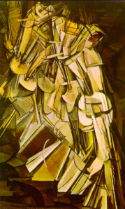
Marcel Duchamp has a similar thought process of movement and transitions..

Screen Shot 2013-05-03 at 13.57.53

Anthony McCall

http://www.tate.org.uk/art/artworks/mccall-line-describing-a-cone-t12031/text-summary

Screen Shot 2013-05-03 at 17.55.30

McCall creates interactive installation pieces, where a white circle has been slowly drawn onto film, taking 30 minutes to fully appear. This creates a cone of light which forms over the period which viewers are encouraged to break or walk through. The experience itself is the art rather than the end product. It sounds on first hearing to be a really boring idea, but to think of standing in dark room for 30 minutes, hearing the noise of the film go around and watching and interacting with a cone of light that slowly appears, actually sounds like it would build up a lot of excitement and be amazing to participate in. It’s a really innovative and creative use of light.

James Turrell – sky spaces

– projects images of the sky onto the floor – camera obscura – Roden Crater project

Screen Shot 2013-05-03 at 18.00.51

Turrell uses the camera obscura technique to project images of the sky onto the floor. I can’t imagine how crazy it is to look at the floor and see the clouds moving! It’s such a simple idea, with artistic and strange results.

His latest piece is the “Roden Crater” project. Reading about this was completely inspiring and just goes to show how big you can dream. He has taken an extinct volcano, and is currently turning it into a naked eye observatory . There will be 20 viewing spaces where you can see far into the sky and space. It is incredible! I thought I was dreaming big hoping to one day run my own gallery..

Time Slicing – The Matrix – Tim Macmillan/Frank Budgen

Time slice or Bullet Time is the technique of showing a moment in time frozen or severely slowed down, while the camera moves around it. It was revolutionary at the time of The Matrix, and was the first real commercial use. It was pieced together digitally and used a lot of equipment to get such a smooth finished product.

http://www.youtube.com/watch?v=KNrSNcaYiZg – from 2 minutes onwards shows the famous ‘Bullet Time’ scene.

Another famous, less digitised use of this effect was produced from the teaming up of Tim Macmillan and Frank Budgen. Through a series of pinhole cameras placed one next to the other over a fair distance, fired simultaneously, they were able to create a stunning video. It was previously unseen and actually caused quite a stir because no one really understood the process.

( I can’t find a link to this )

Nick Knight – Massive attack

In this piece, Knight uses extreme slow motion to create a beautiful film that probably only took a few seconds to film! You see a flower come into correct exposure and suddenly explode, with petals and leaves flying everywhere. You would never ever normally get to see the beauty in a moment like that because it would be gone before you could appreciate it.